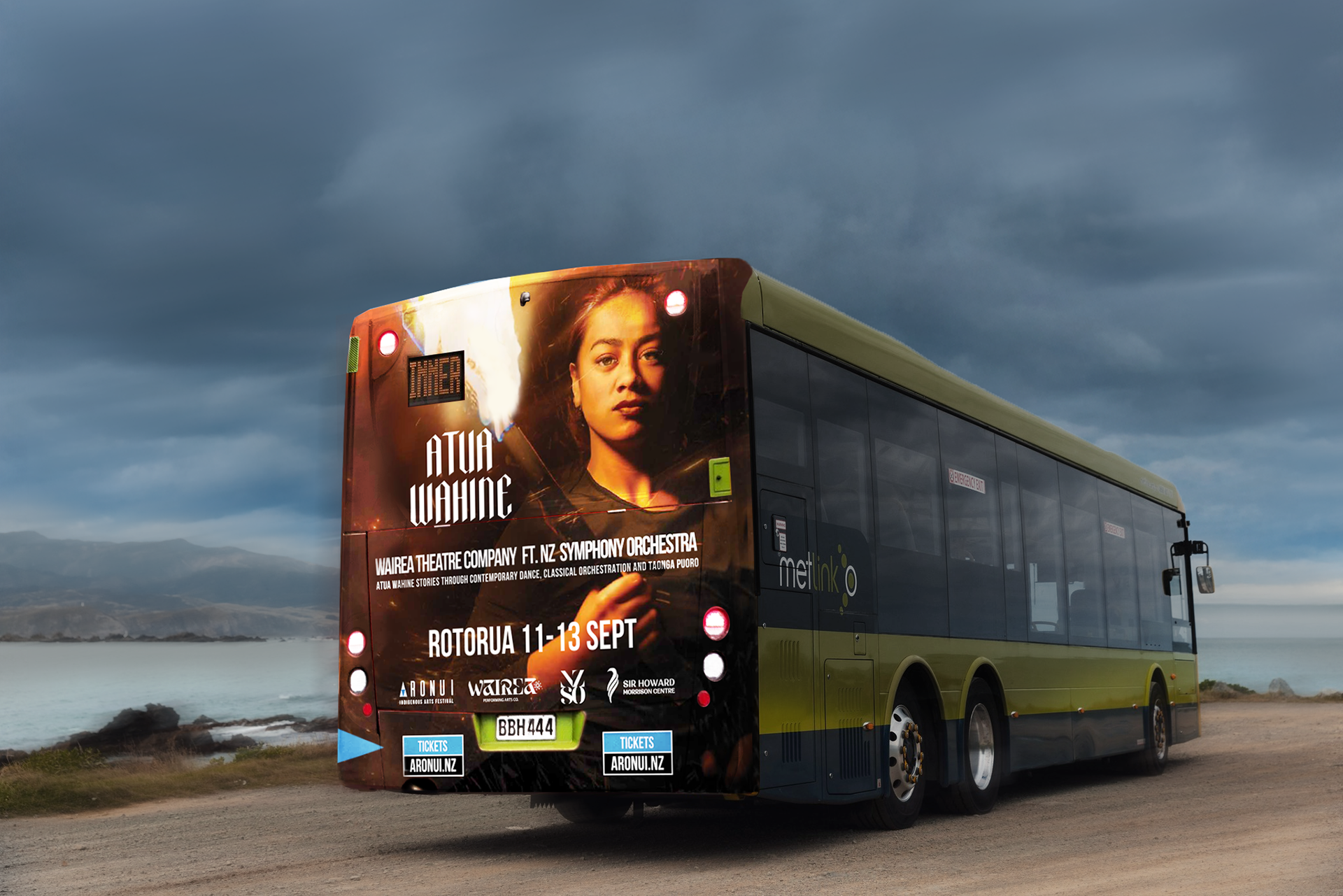
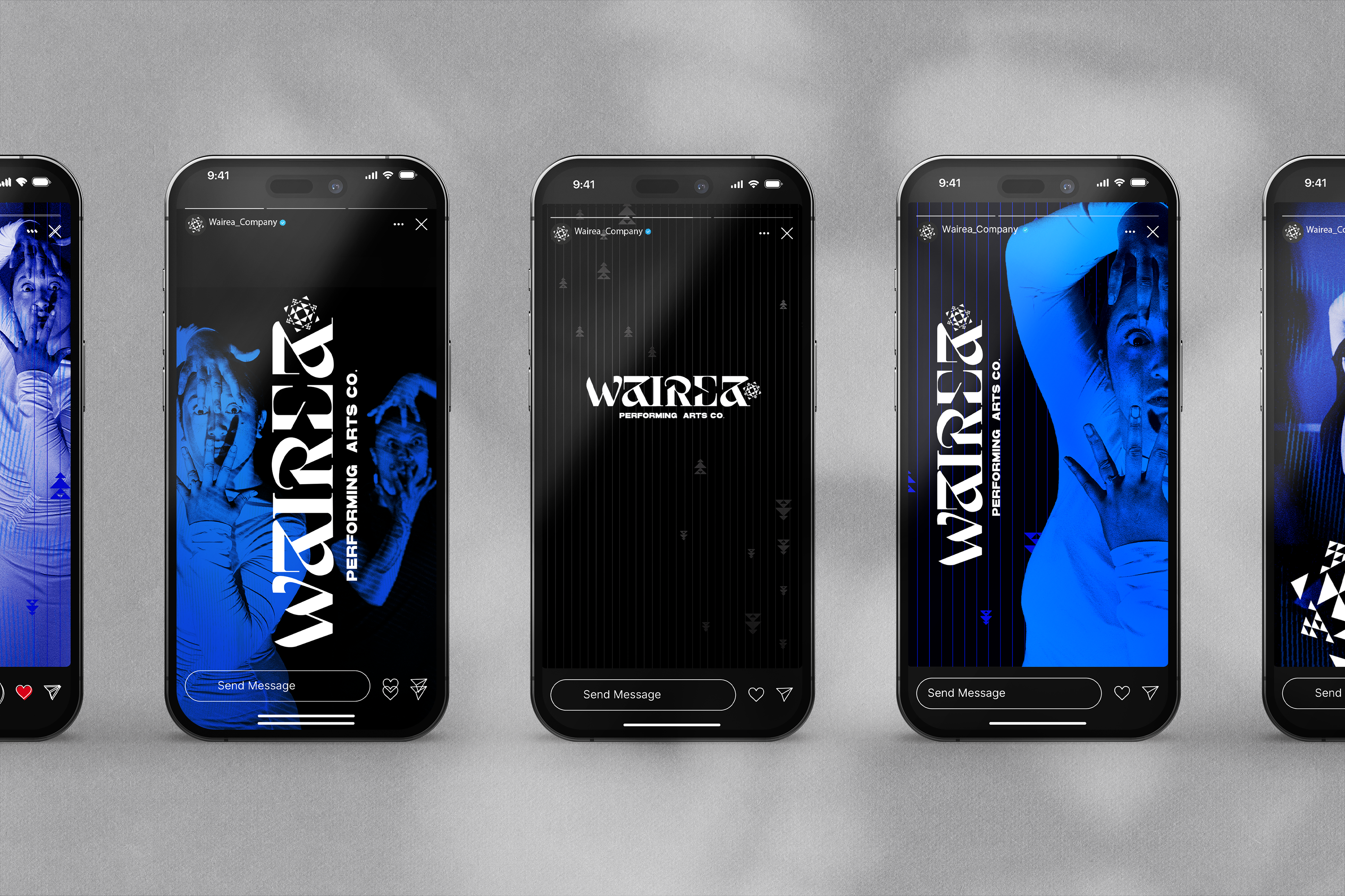
Wairea Performing arts
Deliverables
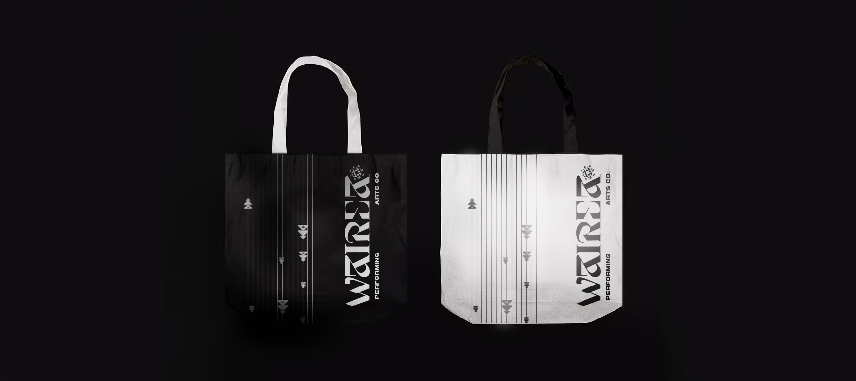
Brand identity
Custom typeface
Brand identity
Custom typeface
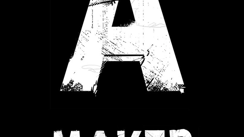
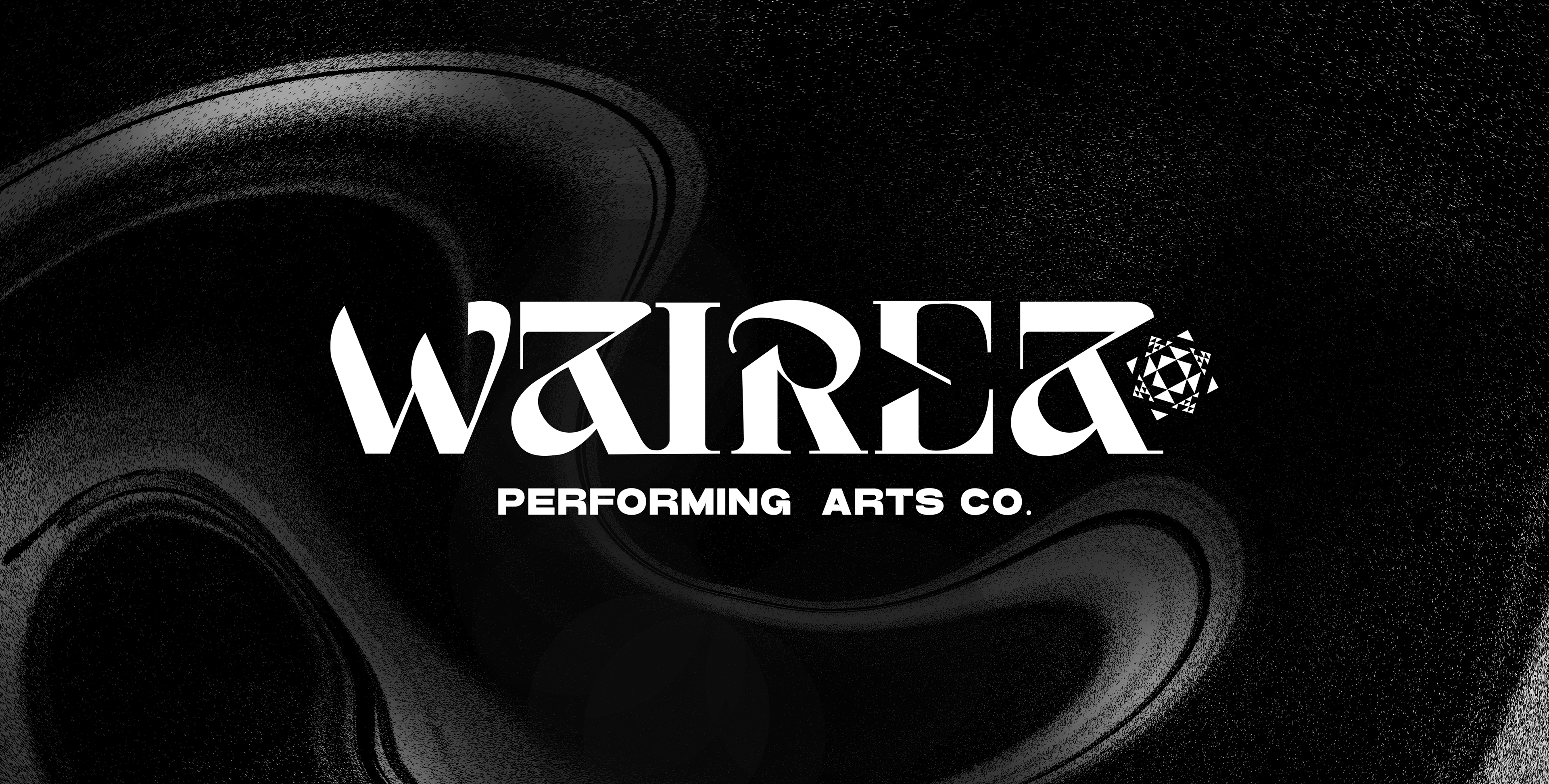
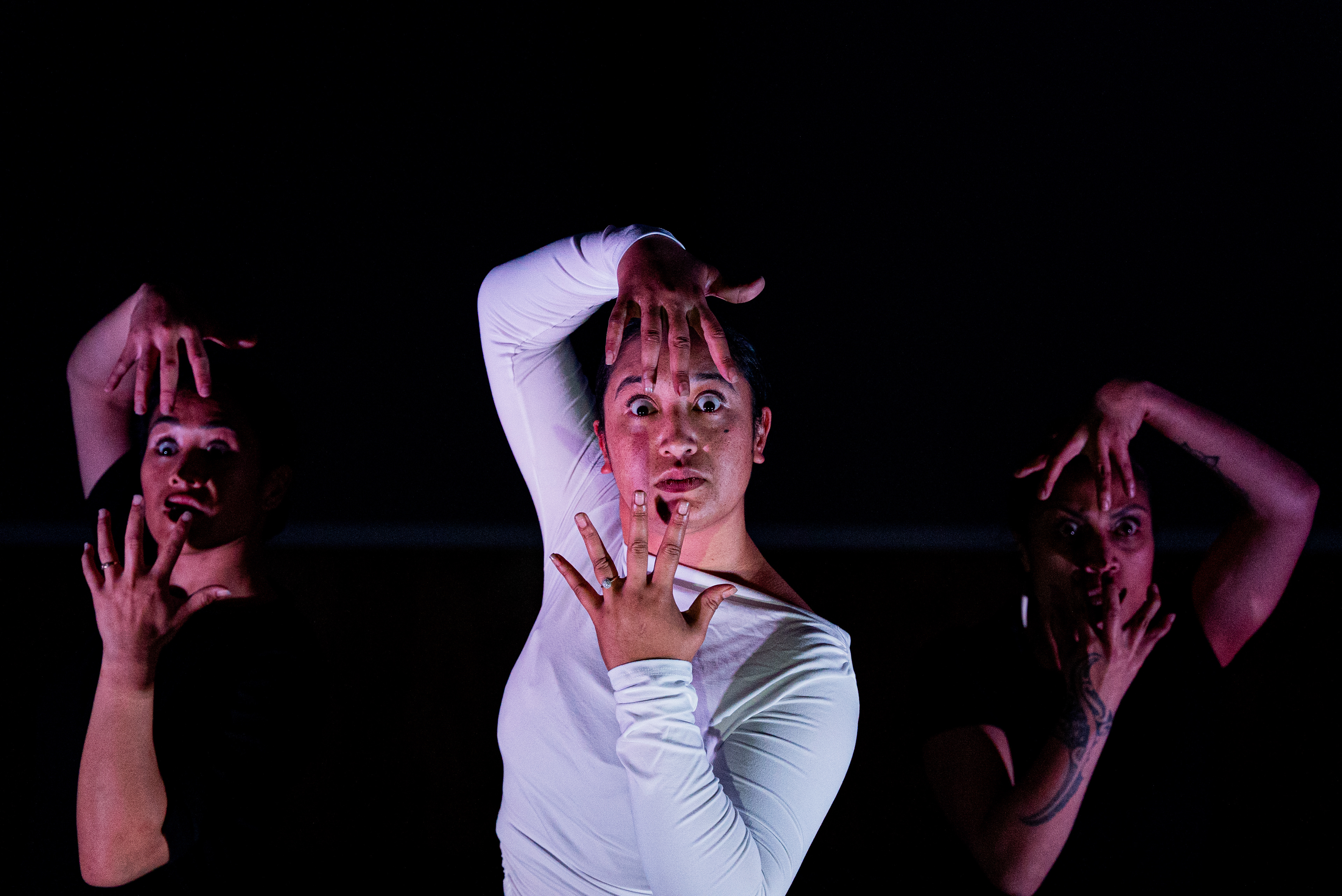
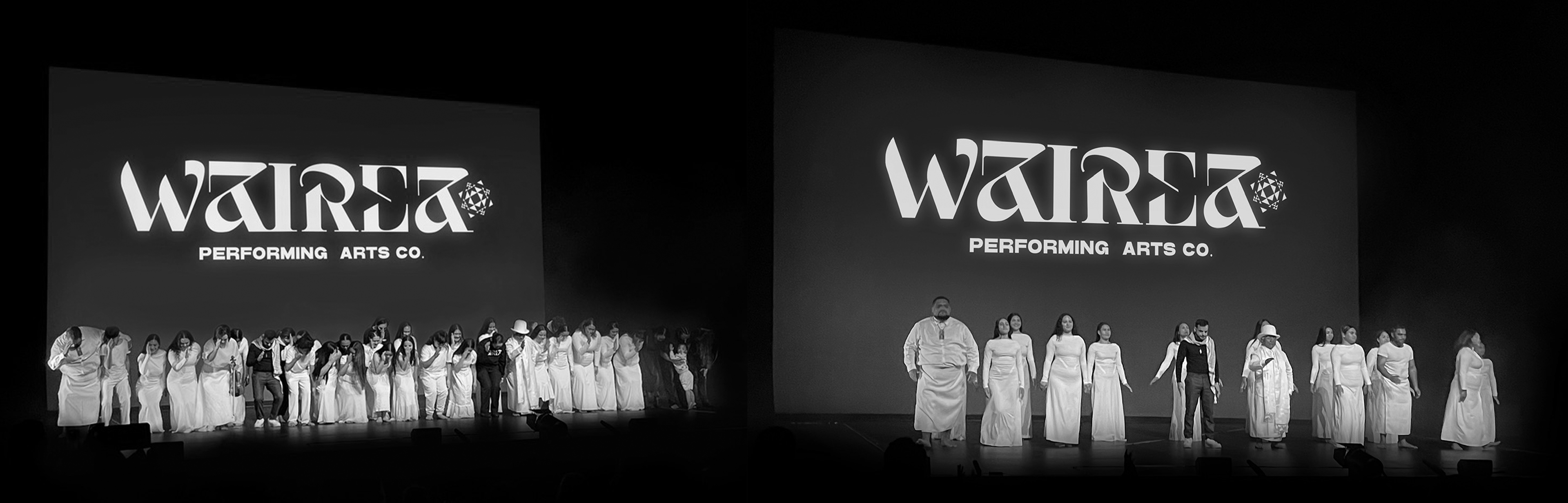
Wairea is an Indigenous performing arts and theatre company. Its creative inspiration draws from whakapapa Māori, specialising in moving art installations, composition and choreography.
The choreography performed at Wairea inspired the custom typography featured in the brand identity. Just as performers execute deliberate gestures with grace and power, the design reflects the interchange of fluidity and strength.
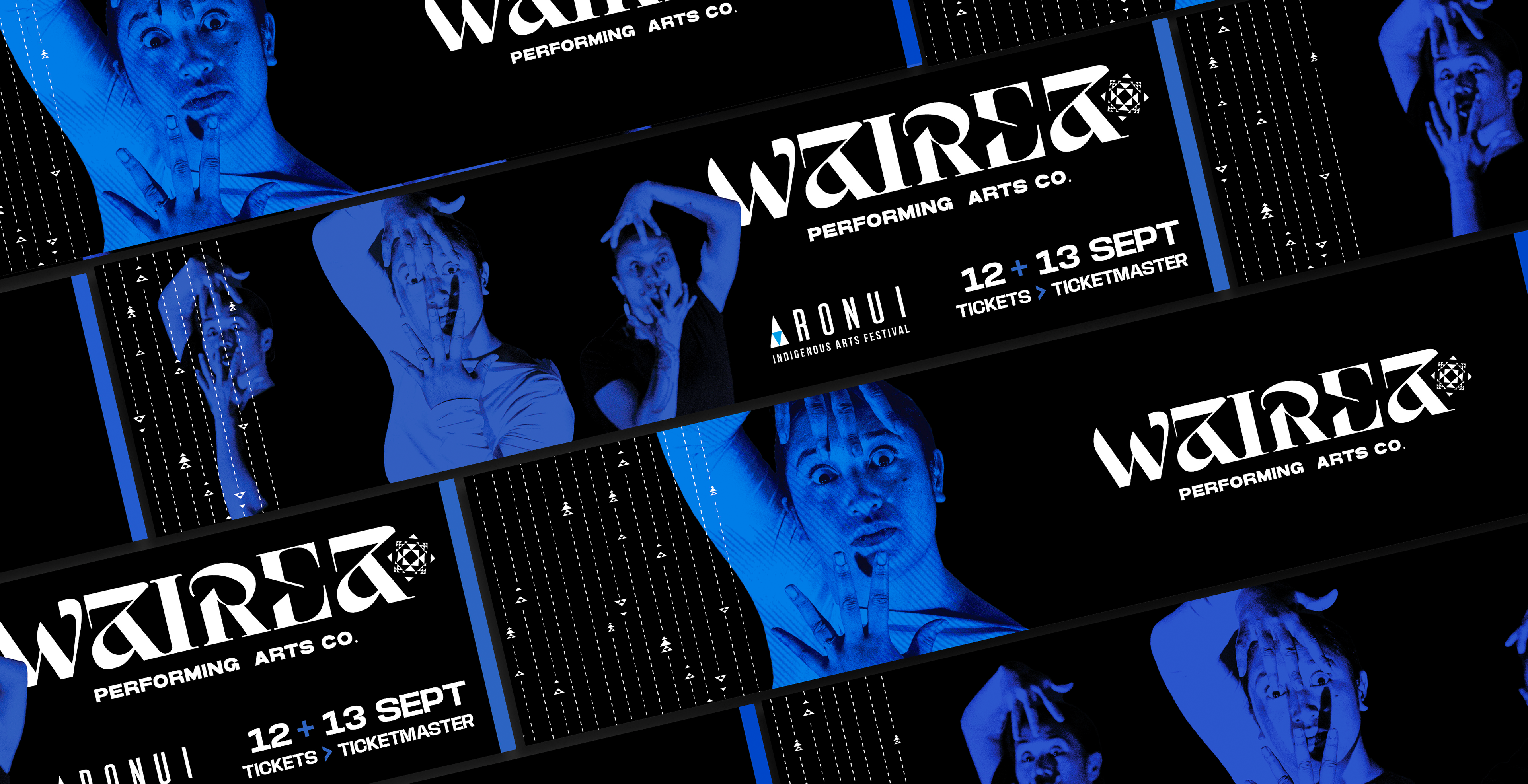
A star compass represents the journey of discovery and exploration into the unknown. It is a fitting feature in Wairea’s brand identity, given their performance style is unchartered territory in Aotearoa. The symbolised kapehu whetū, once used by our tīpuna to navigate across Te Moana-nui-a-Kiwa, illuminates the darkness metaphorically; offering clarity and insight through matauranga Māori while paying homage to the founder’s whakapapa to Ma’uke island and Aotearoa. Aspects of the typography recreate the flow of the Pacific Ocean, providing a subtle nod to the unifying force that bridges diverse cultures and landscapes.
The brand contributes to a visual dialogue; offering a nuanced and unapologetically demanding response to the emotional resonance of performance art. It exudes femininity and stands boldly as a distinctive creation that challenges the conventional perceptions of Indigenous design in contemporary art.
Photography: Reign Creative