Client:
Tōpūtanga Tapuhi Kaitiaki o Aotearoa, New Zealand Nurses Organisation
Tōpūtanga Tapuhi Kaitiaki o Aotearoa, New Zealand Nurses Organisation
Deliverables:
Large brand identity
Large brand identity
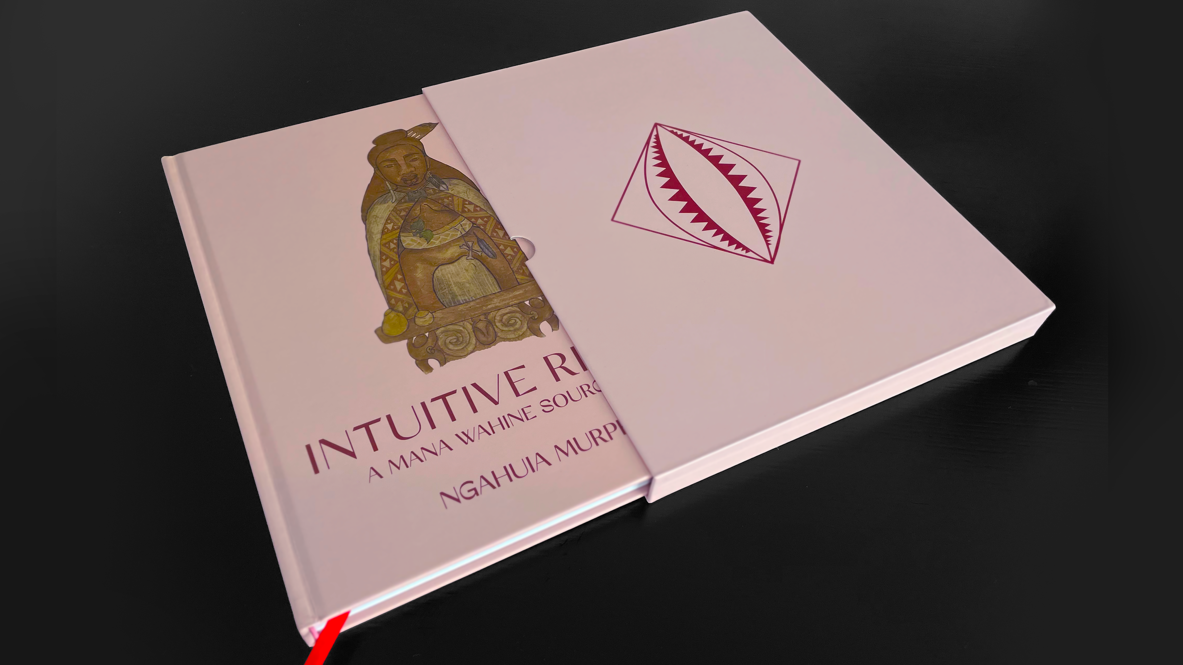
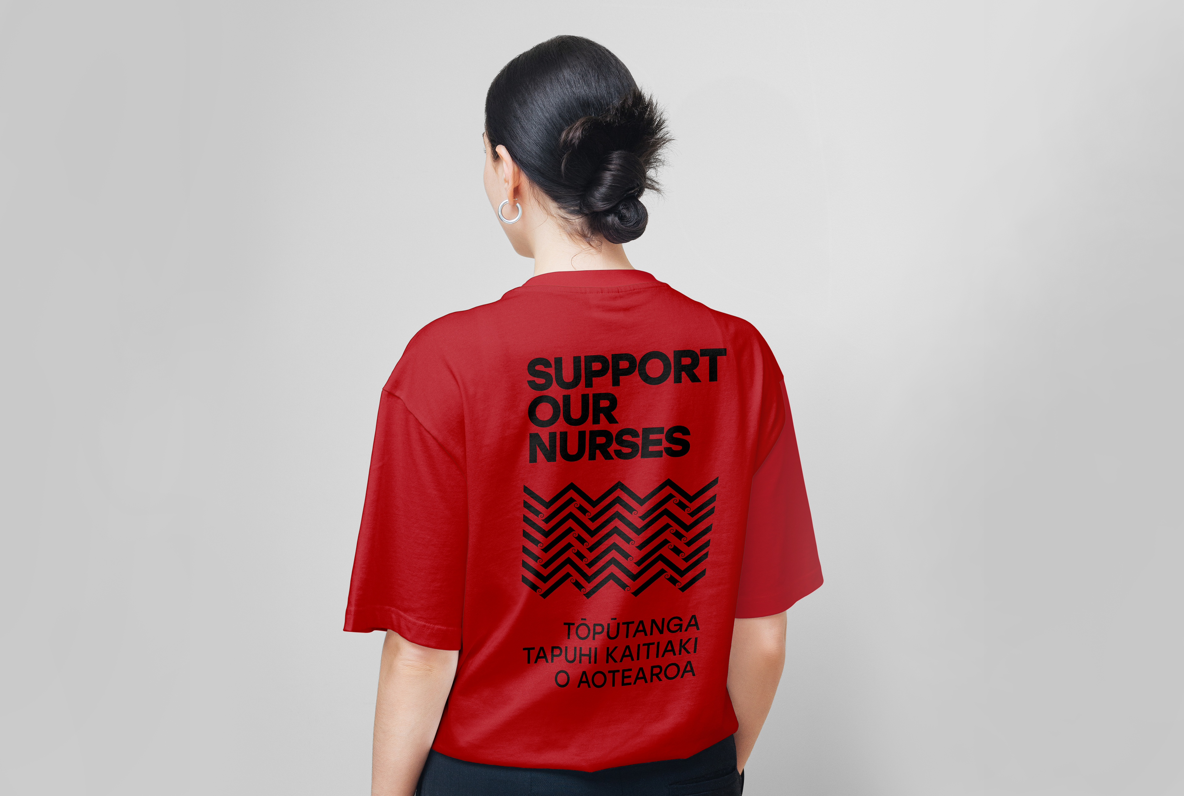
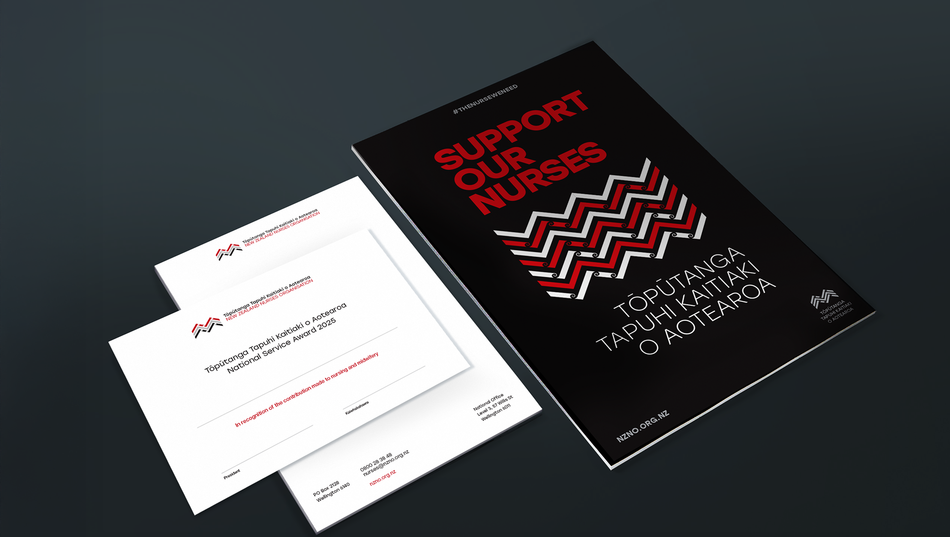
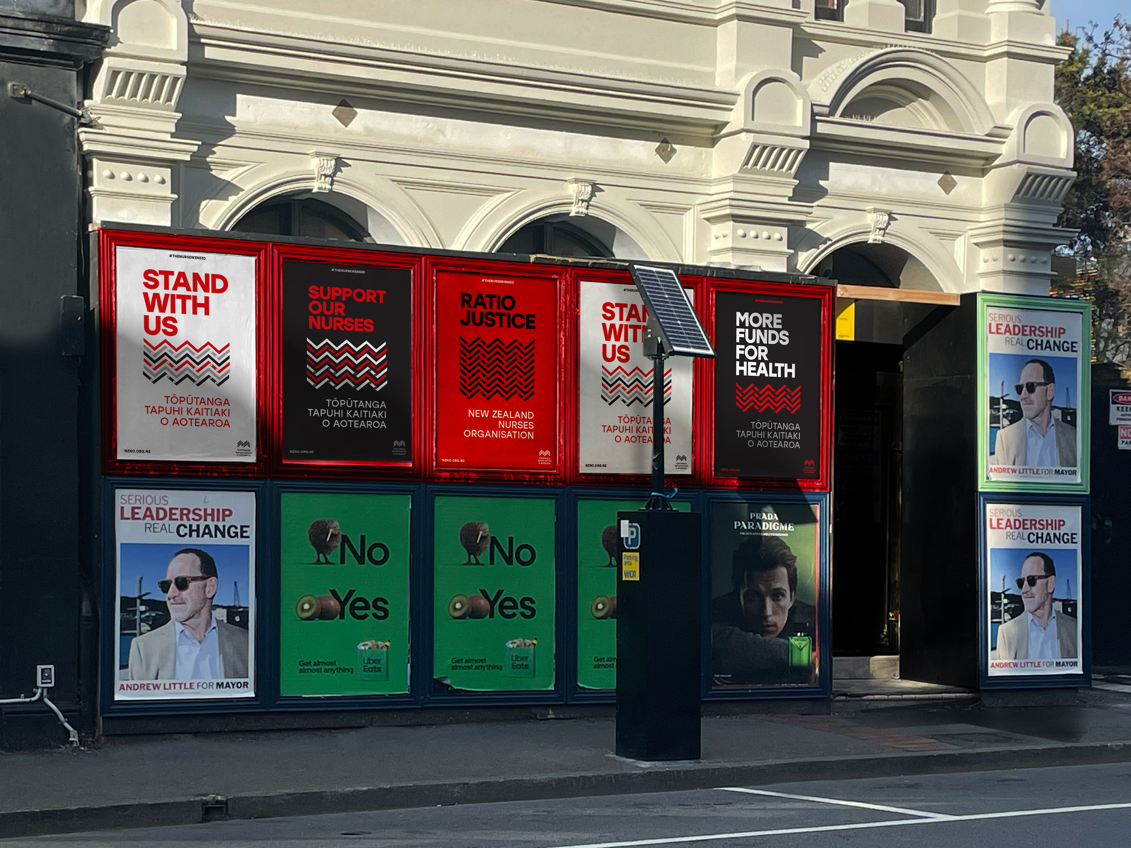
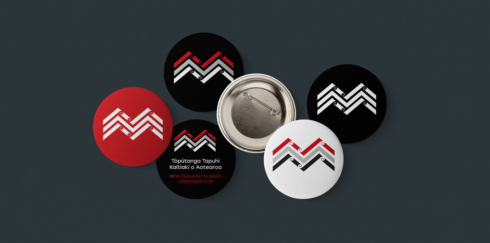
The brand identity for Tōpūtanga Tapuhi Kaitiaki o Aotearoa, New Zealand Nurses Organisation draws inspiration from the pattern kaokao which feature within customary Māori practices such as the rāranga of woven birthing mats, the tāniko boarders of elegant cloaks and tukutuku panels adorning the walls of carved houses. Kaokao is a powerful and enduring pattern that represents strength, unity, and resilience — qualities deeply aligned with our organisation and the vital role nurses play in the health and wellbeing of Aotearoa New Zealand.
Kaokao is a chevron pattern evoking the bent arms and legs of a body that is grounded and poised for action. It signifies both a warrior and birthing stance symbolising endurance, steadiness, physical strength and mental wellbeing. Utilised for the Tōpūtanga Tapuhi o Aotearoa identity, kaokao honours the expertise, resilience, and courage of nurses who continue to extend unwavering commitment, attention and care for whānau and communities throughout Aotearoa.
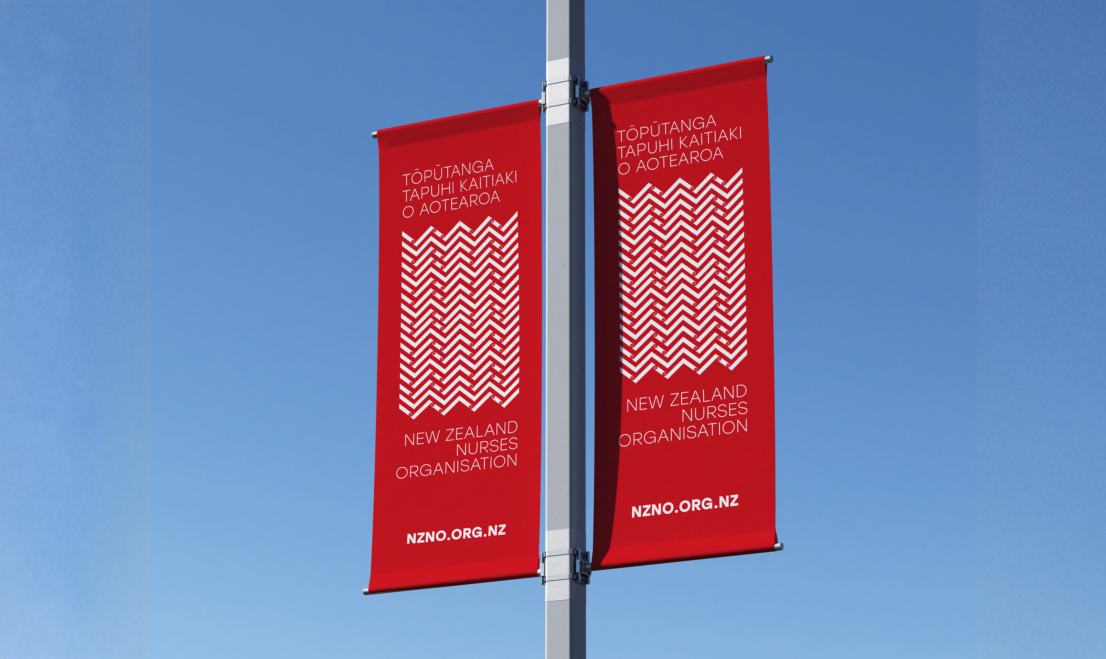
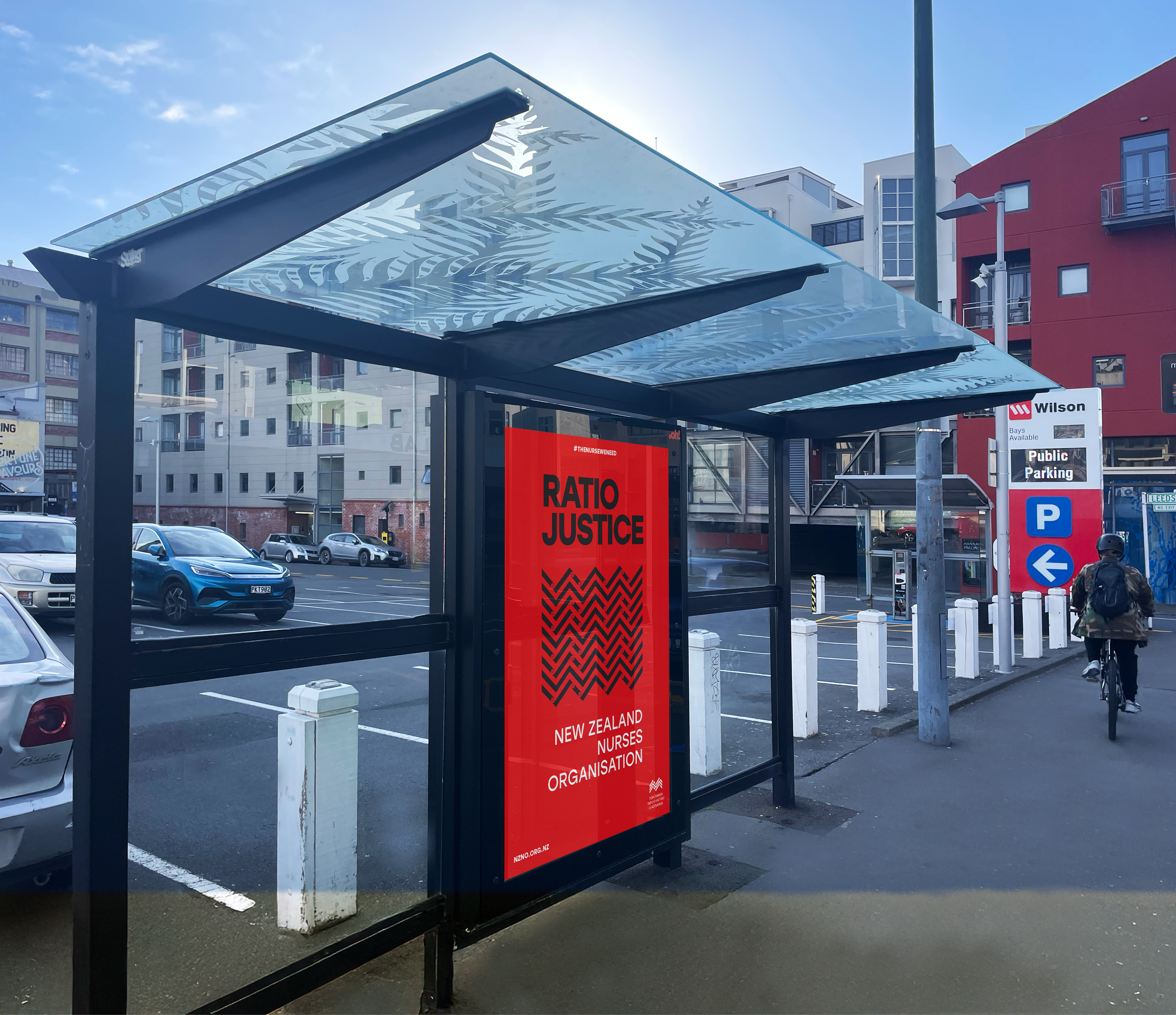
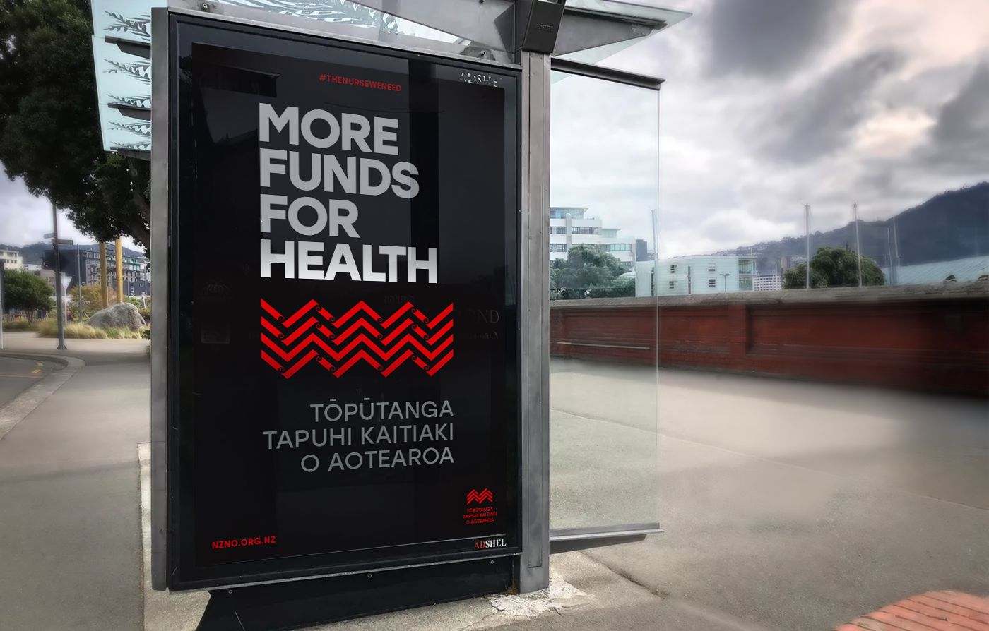
Kaokao often appears as a repeated form — a visual expression of the strength in numbers through kotahitanga and unity. Each line and intersection within the design arrangement represents individual voices and experiences contributing to weave together into a greater whole. This mirrors the very nature of who we are as a collective of diverse professionals, standing together to advocate for better outcomes — not just for themselves, but for the wider health all New Zealanders.